Compass x Glide
Building a design system for iOS, android, and web for Glide
Technical Achievement: Created design system infrastructure and core component libraries for platform integration
Business Impact: Enabled seamless integration of Glide's 50,000+ user platform into Compass Business Tracker
Scale: Supporting 33,000+ Compass agents and 100+ million CRM contacts across the real estate ecosystem

iOS app: Before creating the design system and after

Steppper in design system, shown in mobile and android.
Problem
We were experiencing a growing number of stylistic issues that highlighted consistency concerns. Colors and fonts were not well-defined, and the way we handled components differed from page to page, and systems.
With these problems in mind, we needed to
1) Provide a single source of truth for consistent styles, patterns and UI components
2) Allow to easily swap between Glide and Compass visual branding
3) Increase speed and quality of design and design handoff
Most importantly: Implement a theme-able Design System
Challenges
Structure and Set up:
When we first began work on the DS we struggled with how it would be structured from a technical perspective. Given the constraints, we knew we would need to figure out how working components would be integrated into the system, as well as the actual products, at a later date.
We sought out members from the front end dev team to help determine how to structure the system from a technical perspective.
----Obtained information----
Current state of Glide DS on web: Glide uses styled antD components (third party React UI components).
Current state of Glide DS on mobile: Currently, neither Glide or Compass has the concept of a theme.
Current state of Compass DS: Compass uses a homegrown Compass cx.react React library that utilizes a set of predefined global CSS variables called Compass design tokens.
Approach
For Glide DS v1: Build a Glide Design system with Compass design tokens in mind
Together, we wanted to iterate towards building a robust design system. This encouraged members from various departments to be involved throughout the process. Monday acted as a status page and informed team members which components were ready and which still needed documentation.
To create a systematic design, we chose to take a more structured approach.
I did not want to fall into the trap of continuosly redesigning the same components without fully understanding the current state of the interface.
To help me understand the curent state of the Glide applications, I conducted an interface inventory in which I compiled all components and guidelines from previous design work.
An interface inventory showing icon inconsistencies
Notes
iOS: There was a file that compiled the components used in the app.
Android: There was not a file for Android components. No android application.
Web: The company uses AntDesign as a web framework.
Observations: There was no definition for text styles; color themes did not match the components between iOS, Android, and the web; design files were incomplete.
Architecture
Our criteria for the ds was to create predictable categories that were easily discoverable, and an architecture that could adapt to changes seamlessly. Together with the lead developer we defined a structure upon which we would build the system. Most importantly, the most common elements like typography, colors, buttons, and inputs would be detached from any specific context.
For example, we defined our typography styles with generic titles instead of specific ones (i.e. “H1” instead of “large-title”). Also, I focused on aligning the typography with the baseline grid and measurement system for better readability.
Similarly, our color palette was broken down to system colors spread across several tints.
Having defined a basic system for colors, typography and spacing, I then moved onto buttons, inputs and forms since these make up more complex components and flows.

I defined each component, and reduced the number of components by using the Compass Design system as a reference. The Compass design system team reviewed changes, and acted as experts on the subject matter. Any new components being introduced from the Glide library had to be designed in conjuction with Compass’s DS team to ensure it can be implemented in the Compass DS. This helped prevent inconsitinency within the system. The Glide DS is managed in a dedicated design library on Figma.
Shown on the right is Compass x Glide: Business Tracker
iOS and Android
It was important to have branding remain consistent throughout the different platforms. Having our designs aligned to Glide’s brand would mean that our users would be benefiting from a holistic experience across Glide’s desktop & mobile products. Some components were deliberately left “native” in order to keep the familiarity associated with each platform.
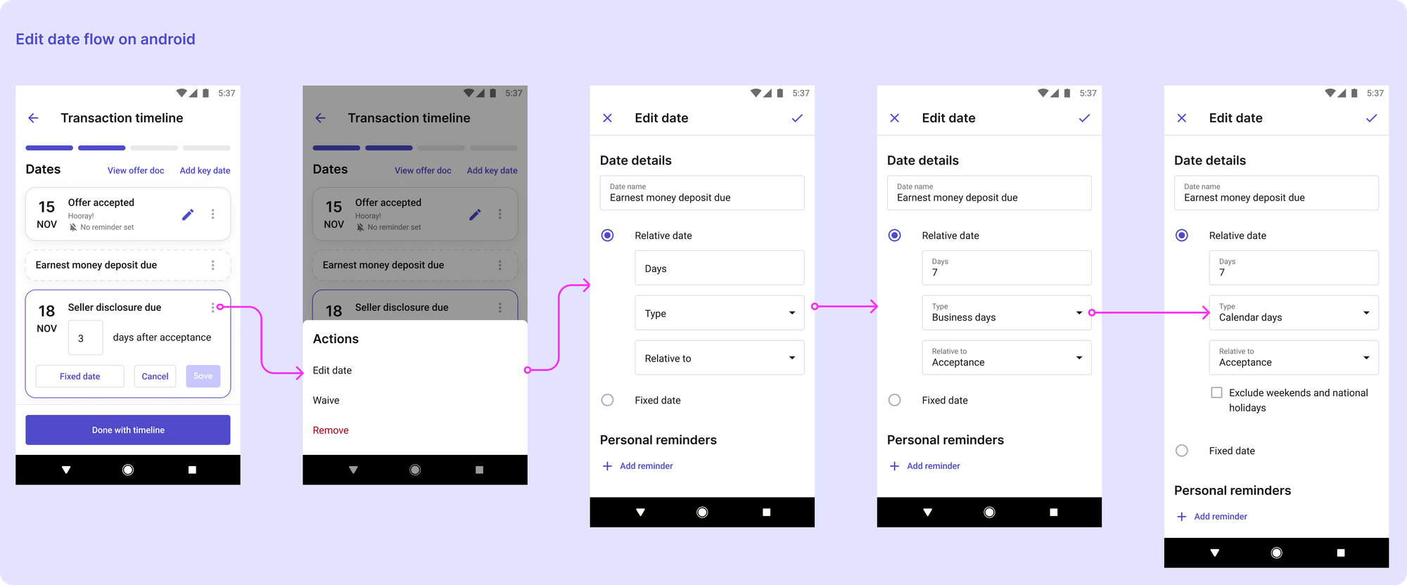
Shown below the edit data flow on desktop, iOS, an android. Part of designing the DS included building frames for iOS and android apps.


Key learnings
Overcomplicated component libraries make a design system hard to adopt by dev and design.
Remember that reiterating goals often ensures that teams are working towards a shared vision.
Its important to align your efforts with the goals that other team members have set out to accomplish. A design system is an ongoing project, establishing a strong foundation that teams can rely on will help promote the design system throughout the org.