Compass
Design Systems
Building a design system for iOS
My Role
I designed, planned, tested, and documented new components while mapping dependencies and best practices. I also ran research sessions with Glide users to identify gaps and opportunities, and I onboarded designers and engineers to the Glide DS.
Problem and goal
The iOS app had inconsistent components and UI that felt heavy and not intuitive. This created friction for brokers who relied on the app in fast, high-pressure moments, and it made the app harder for engineers to maintain. To scale Glide needed a design system that brought consistency to mobile, improved engineering workflows, and aligned to Compass's design systems.
Before changes (left) vs After changes (right)

magnifying-glass-plus
Click on the image to zoom in
Research Overview: iOS vs Web UX
Designing for iOS is different from designing for the web. Web UX equals larger screens, precise mouse input, and high visibility of content.
iOS UX is built for small screens, finger input, and quick, focused interactions
Touch first: controls need large hit areas and spacing to avoid errors
Contextual navigation: iOS uses tab bars, navigation stacks, and gestures
Dynamic type and layout: text and spacing adapt to device sizes and accessibility settings
Fluid transitions: motion and feedback make changes feel natural and predictable
Introduction to Compass DS
The Compass Design System has three levels. Foundations are the basics like color, type, spacing, and shadows. Components build on those foundations with buttons, links, and banners that are styled and accessible. Patterns sit at the top and combine components into solutions for tasks like filtering, forms, or error handling.
What I Worked On
I worked on avatars, badges, banners, buttons, date pickers, dialogues, dropdowns, lists, snackbars, toasts, headers, and navigation for iOS
Example: Banners for iOS design system
Clear: short text with an immediate purpose.
Consistent: same spacing, color, and position every time.
Hierarchy: it is a secondary message, so it should not overpower the main content.
Platform expectations: iOS users expect info to slide in and out smoothly without blocking them.

magnifying-glass-plus
Click on the image to zoom in
Cross platform questions I asked.
Color of the info banner (which shade of grey?)
Can these banners stack and how? With what spacing?
Are these sticky or do they scroll with the page? What would be the default behavior?
Do we add an optional top separator / border?
Do we want to have a default icon for the banners when the left icon is displayed?
Wants:
Bottom separator / border will be there on default but removable as an option.
The tap target of the CTA should be most of the left side of the banner.
Glide theme
Glide theme design tokens made it possible for apps that needed to deviate from Compass DS components to still stay consistent with the Compass DS language. This was critical because Glide had its own branding and user base. Tokens let us keep Glide's brand while keeping alignment with Compass, which maintained consistency and trust.

Having our designs aligned to Glide’s brand would mean that our users would be benefiting from a holistic experience across Glide’s desktop & mobile products. Some components were deliberately left “native” in order to keep the familiarity associated with each platform.

Using eSign to build and update DS Components
When I updated eSign iOS components, I broke the flow down step by step:
User enters a document
All annotation types live in a bottom tab bar
User selects an annotation → the tab bar collapses and a placement toast appears
User taps to place annotation → feedback confirms assignment
Options for edit, delete, resize, and grouping appear
Edit opens page with detailed controls
Documenting this flow let me turn annotations, toasts, sheets, and grouping behaviors into reusable design system components.
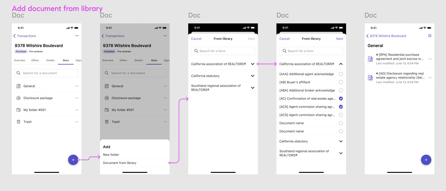
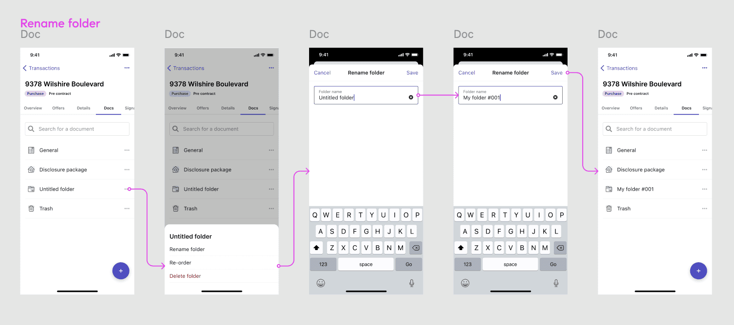
User testing
As part of the design process, I incorporated user testing. I led sessions with agents to walk through common flows like adding, renaming, and searching documents using prototypes I created. The images highlight the flows we tested, and based on feedback I refined details before rollout.


magnifying-glass-plus
Click on the image to zoom in
Collaboration
I worked in a pod alongside Android and iOS engineers to scale the design system across platforms and regularly sought feedback from the Compass design system team during their office hours to align with broader ds standards and improve adoption.
Key learnings
Overcomplicated component libraries make a design system hard to adopt by dev and design.
Remember that reiterating goals often ensures that teams are working towards a shared vision. Its important to align your efforts with the goals that other team members have set out to accomplish. A design system is an ongoing project, establishing a strong foundation that teams can rely on will help promote the design system throughout the org.