XCHANGEPLUS
Role —UX Lead
View —Website
Summary:
Problem: How can we help the development team build and ship scalable products?
Solution: Build a design source to communicate designs for all web based platforms.
Impact: The team's productivity score is 200% higher than year before. Communication between design and dev team is more effective.
About this case study
Great design systems allow teams to innovate and create at faster speeds. Our goal was to rapidly improve the velocity with which the dev team at XchangePlus build, in addition to creating a shared design language around software for future teams to leverage-- XP components were later used in MyBrokerTools software. I created a style guide to unify the XP software. Everything from typography and color, to buttons, flags (or toasts), banners, dialogs, illustration guidelines, list views, switches, badges, and more were designed over the span of just a few months.
Role
Lead Product Designer
Design Questions
What are the current disadvantages?
What is the main problem in our development process?
Initial Research
The history of design systems can be traced back to large enterprises. It is difficult to avoid mistakes at scale when working with large teams of designers and engineers, resulting in a requirement for design systems.
We can design, develop, and ship products more efficiently with the help of a design system. Designers and engineers can collaborate more effectively and spend more time developing. This is true for businesses of all sizes.
Organize
I conducted an interface inventory to compile all components created by other designers.
Front End: React + Vanilla JS + jQuery (legacy)
Observations: Text styles were not defined; color themes did not match the components between web and mobile; components' files were generally incomplete and scattered.
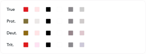
Color
Design language represents essential design properties.
Our main priority was to design clear and accessible colors that help convey intent. XP’s design language spans over color, iconography, and typography.

The color palette was developed with the intention of being accessible to those who are colorblind.
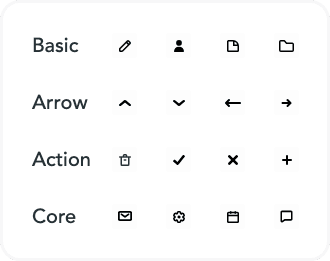
Iconography
I worked with another designer to create a set of icons that mimicked the style already implemented. It was important for us to match the brand guidelines.
Typography
We used Inter typeface throughout the software. Inter is a typeface designed for web screens. Inter has a tall x-height to help with mixed-case and lower-case text reading, as well as contextual alternatives for highlighting keystrokes and tabular numbers.

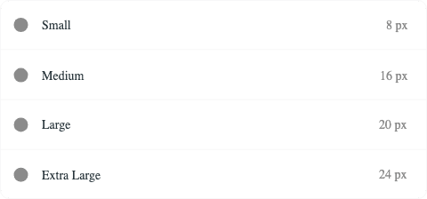
Grids and Layout
It's vital to determine which efforts have the most influence on a design system. In our situation, grids, layout, and space were crucial. A responsive grid of 8 pixels allows a layout to adapt to the size of the screen. This guarantees consistency across the products.
Components
Components are building blocks for creating UI and include a system to communicate states. I made these libraries available for web.
Buttons
Dividers
Controls
Inputs (example below)
Lists
Tabs

Challenges
One of the most difficult aspects of developing a design system is demonstrating its intrinsic value to the company. This, I believe, occurs because measuring influence is rather subjective. Should the number of components be used to determine success or failure? Or in the structure's complexity?
Another challenge was taking patterns from XP that were never intended to work on mobile and evolving them without sacrificing the data shown. To solve this problem we approached each component carefully, considering how the dev team determined standards for their guidelines while also looking at mobile conventions and optimal user experience.
Outcome
During sprint reviews in the early months of using and improving it, our engineers began to discuss the design system. They understood how rapidly we could design and create when the product's components are consistent across platforms.
We worked 2x faster!
What did I learn?
Design sytems are beneficial and a work in progress. Its important for collaborators to understand and communicate a design system.
Overall- helped showcase the importance of product design to all teams 😀️